



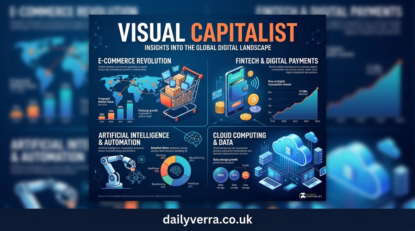
In a world filled with numbers, statistics, reports, and endless streams of information, understanding what the data really means can be difficult. A long report may contain valuable facts, but many readers struggle to turn pages of numbers into a clear picture. This is where Visual Capitalist has built its distinctive identity. By combining data, research, charts, infographics, and concise explanations, the platform makes complicated subjects easier to understand and remember.
Visual Capitalist is widely recognized for presenting information visually across areas such as business, economics, technology, finance, demographics, energy, commodities, and global trends. Instead of simply telling readers that something is changing, its visual approach often helps them see the change. That difference can make a major impact on how people learn about complicated topics.
The popularity of visual information also reflects a broader change in the way people consume content. Readers increasingly want information that is quick to understand without sacrificing meaningful context. A thoughtfully designed chart can sometimes communicate a relationship between dozens of data points more effectively than several paragraphs of explanation.
What Is Visual Capitalist?
Visual Capitalist is a digital media and data visualization platform known for transforming complex information into accessible visual content. Its work commonly focuses on economic trends, financial markets, industries, natural resources, technology, global development, and other subjects where data plays an important role.
The platform’s central idea is relatively simple: information becomes easier to understand when it is presented visually and supported by useful context. Charts, maps, timelines, rankings, diagrams, and infographics can reveal patterns that may be difficult to notice when the same information appears only in written form.
What makes the approach particularly interesting is that visual storytelling is not limited to making information attractive. Good visualization should help answer a question. For example, a graphic comparing countries can reveal differences in population, economic output, energy consumption, or resource production at a glance. A timeline can make historical developments easier to follow, while a flow diagram can explain how a complicated system works.
Visual Capitalist has therefore become a useful reference for readers who want a quick overview of a subject while still seeing the numbers behind the story. Its content is particularly appealing to students, investors, business professionals, researchers, educators, and curious readers.
Why Visual Data Is So Powerful
Humans naturally respond well to visual patterns. When information is presented through shapes, colors, positions, maps, and charts, relationships can become easier to recognize. A table might require a reader to compare dozens of individual numbers, while a properly designed graphic can make the overall pattern immediately noticeable.
Consider a simple example involving population. If a reader is given the populations of 20 countries in a written list, understanding the differences requires active comparison. A bar chart can instantly show which countries have larger or smaller populations and roughly how significant those differences are.
The same principle applies to financial and economic information. Market movements, commodity production, national debt, trade relationships, technological adoption, and demographic changes often involve large amounts of data. Visual storytelling can organize these details into a structure that feels much more manageable.
But there is another important advantage: visuals can encourage curiosity. When readers see an unexpected number or unusual pattern, they may naturally want to know why it exists. That can lead them beyond the graphic and into the underlying research.
Exploring Major Topics Covered by Visual Capitalist
One reason Visual Capitalist attracts such a broad audience is its wide range of subjects. Its content frequently explores areas where statistics and comparisons can help explain the bigger picture.
Business and Economics
Economic stories can quickly become complicated because they involve multiple countries, industries, currencies, policies, and historical factors. Visual representations can simplify these relationships without necessarily removing the important details.
Readers may encounter graphics covering economic growth, inflation, national economies, trade, consumer behavior, employment, or business trends. Rather than reading a lengthy economic report first, someone can use a visual overview to understand the main idea and then investigate the subject more deeply.
Finance and Markets
Financial information is another natural fit for visualization. Markets generate enormous quantities of data every day, and investors often need to identify trends rather than examine every individual number.
Charts can help readers understand historical market performance, asset comparisons, company rankings, industry movements, and broader investment themes. However, visual content should be treated as educational information rather than a substitute for independent financial research. A compelling graphic can highlight a trend, but it does not automatically explain what will happen next.
Energy and Natural Resources
Energy, mining, commodities, and natural resources are particularly suitable for visual storytelling because production and consumption can vary dramatically across countries and regions.
A map showing where major resources are produced can communicate geographic concentration quickly. Similarly, a chart comparing energy sources can make it easier to understand the changing role of oil, natural gas, coal, nuclear power, solar energy, wind power, and other technologies.
These subjects are often connected to larger discussions about economics, geopolitics, industrial development, and environmental policy. Visualization helps readers see those connections.
Technology and Global Trends
Technology changes rapidly, making it useful to examine adoption rates, market shares, industry growth, and demographic patterns visually.
Visual Capitalist-style graphics can help explain subjects ranging from internet usage and artificial intelligence to semiconductor production and emerging technologies. Instead of treating technology as a collection of isolated products, visual storytelling can place developments within a larger global context.
How Visual Capitalist Makes Complex Information Easier to Understand
The effectiveness of visual content depends heavily on organization. Simply placing numbers into a colorful graphic does not automatically create useful communication. The most valuable visualizations establish a clear hierarchy and guide the reader toward the most important information.
A strong graphic usually starts with a focused question or idea. It then organizes supporting information around that central point. Titles, labels, icons, charts, maps, and short explanations work together to create a logical reading path.
This approach is especially useful when the original subject contains many variables. A visualization can group related information, emphasize important comparisons, and reduce unnecessary distractions.
Context also matters. Numbers without explanation can sometimes be misleading. A percentage may look impressive until the reader discovers that it comes from a very small base. Likewise, a country’s ranking may appear meaningful without considering population, geographic size, economic structure, or historical circumstances.
For that reason, readers should look beyond the visual appearance of any chart and pay attention to its methodology, sources, dates, definitions, and assumptions.
The Importance of Sources and Data Context
One of the most important lessons from data-driven media is that numbers need context. A statistic is not automatically meaningful simply because it is presented in a professional-looking graphic.
Readers should consider where the data came from, when it was collected, what population or category it represents, and whether different sources use the same definitions. Data can also change over time, meaning an older visualization may no longer represent the current situation.
This is particularly important for subjects such as economics, technology, energy, and markets. New information can significantly change rankings and trends.
A responsible reader should therefore treat visualizations as a starting point for understanding rather than the final word on a complicated subject. When a topic matters for an important decision, checking the original source and more recent information is always worthwhile.
Why Visual Storytelling Works for Modern Readers
People are exposed to an extraordinary amount of information every day. Long reports still have an important role, but many readers first want a quick way to understand the basic story.
Visual storytelling fits this behavior because it provides a structured entry point. Someone can quickly identify the main trend, understand a comparison, and decide whether the topic deserves deeper research.
This does not mean written explanations are becoming irrelevant. In fact, the best visual content often works together with text. The graphic attracts attention and communicates the core pattern, while accompanying explanations provide nuance and context.
That combination makes visual storytelling particularly effective for educational content. A student studying economics, for example, might understand a concept more quickly after seeing a chart and then use a detailed textbook to explore the theory behind it.
How Readers Can Get More From Visual Data
Getting the most value from a data visualization requires a little more than simply looking at the biggest number. Start by identifying the question the graphic is trying to answer. Then examine the labels, units, timeframe, and categories.
Next, look for patterns. Are values increasing or decreasing? Are there major differences between regions? Does one group dominate the chart? Are there surprising outliers?
After noticing a pattern, ask why it exists. That final step transforms passive viewing into active learning. A visualization might show that one country produces significantly more of a resource than another, but the deeper question is what explains that difference.
Readers should also remember that every visualization involves design choices. The selection of categories, scale, timeframe, and comparison can influence how information appears. Understanding these choices helps readers become more confident and critical consumers of data.
The Future of Data Visualization
As the amount of available information continues to grow, the importance of clear data communication is likely to increase. Artificial intelligence, interactive graphics, real-time datasets, and new digital publishing tools are opening additional possibilities for explaining complicated subjects.
Future visualizations may become increasingly interactive, allowing readers to explore specific countries, industries, time periods, or categories themselves. Instead of looking at a fixed chart, users may be able to adjust filters and discover different perspectives within the same dataset.
Even as technology changes, the basic principle remains the same: useful visualization should make information clearer, not merely more decorative.
Conclusion
Visual Capitalist demonstrates why visual storytelling has become such a powerful way to communicate information. By combining research, statistics, charts, maps, and concise explanations, it helps readers approach subjects that might otherwise feel overwhelming.
Its biggest value is not simply that it makes data look attractive. The real strength lies in making relationships, comparisons, and trends easier to recognize. Whether the subject is finance, economics, technology, energy, business, or global development, a well-designed visualization can provide a useful starting point for understanding the bigger picture.
At the same time, readers should remain thoughtful about the information they consume. Checking sources, considering context, understanding timeframes, and looking beyond headline numbers are essential habits.
In an increasingly data-driven world, the ability to understand information visually is becoming an important skill. And platforms such as Visual Capitalist show just how effectively numbers can become stories when they are presented with clarity, context, and thoughtful design.
